A Summer Colour Palette for Your Local Business - 2026 Guide
• Tuesday, 16th June 2026 • Branding •
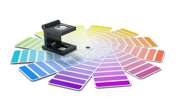
Colour sells before the customer reads the first word
Consumer psychology research is unambiguous: 90% of the first judgement of a product or company is based on visual perception, and the decision whether to trust a brand is made within 7 seconds. In that short window colours play the leading role – before a customer has time to read your company name, they have already read its colour palette.
The summer 2026 season brings several clear colour directions that are worth knowing when planning a refresh of your visual identity. This is not about copying general trends – it is about the conscious use of colour psychology combined with the character of your business and the local context. That is exactly what this guide is about.
Whether you run a restaurant on the Pomeranian coast, a craft shop in central Gdańsk or gardening services in the Kartuzy county – a good colour palette is one of the cheapest and at the same time most effective ways to make your brand stand out in the local market.
Why a colour palette is strategy, not aesthetics
Many local businesses approach colour choice intuitively: the owner likes green, so the logo is green. That is not a bad approach in itself – the problem arises when colour is the only, accidental criterion, without an understanding of what that colour communicates to customers.
Colours work on three levels:
- The emotional level – they evoke immediate associations and moods, often without conscious involvement. Warm orange evokes energy and appetite. Deep green suggests nature and trust. Navy communicates professionalism and calm.
- The associative level – they link a brand with a particular category or values. Eco-friendly companies reach for greens and earth browns, because these colours are already culturally coded as natural. Premium companies use black, gold or deep shades of navy.
- The level of distinctiveness – they set you apart from the competition in your category. If all your competitors in the region use blue, consciously entering with a warm terracotta can be a powerful way to stand out.
Understanding these three levels allows you to choose a palette consciously rather than by chance.
Colour trends for summer 2026 – what is shaping the market
Summer 2026 brings several clear directions, visible both in global design reports (Pantone, WGSN) and in what resonates with Polish consumers.
Earthy shades with a summery lift
The dominant direction is the so-called warm neutrals – warm, earthy tones combined with vivid accents. Imagine a palette built from:
- Light sand (Sand Dune, around HEX #C4A882) as a base
- Deep terracotta (Rust Terracotta, #B5502E) as the main colour
- Muted olive (#7A8450) as an accent referring to nature
- Off-white (#FAF7F2) as the background and breathing space
Such a palette works perfectly for businesses whose identity is based on locality, craftsmanship and authenticity – restaurants, bakeries, regional products, gardening services, craftspeople.
Saturated summer – a bold alternative
The second clear direction is a return to saturated, joyful summer colours – but used with restraint and sophistication, not in a festival style. Pantone promotes the shade Pale Banana (12-0824) as key for the 2026 season. It is a warm, mature yellow, far from an aggressive neon colour, which combines easily with:
- White or cream as a base
- A deeper coral (#E07055) as the action and CTA colour
- Sage (#8FAF8C) for balance and freshness
A palette of this kind suits businesses wanting to communicate energy, joy and seasonality – ideal for tourism, catering and events.
Understated luxury – for premium businesses
The third direction is the so-called quiet luxury transferred to the local market. We drop the flashiness in favour of a subtle signal of quality: a cool ecru (#F0ECE3), a steel blue-grey (#8B9BAA), a deep bottle green (#1E4D3A) and gold details as an accent. Such a palette builds a sense of exclusivity without pretension – it works for service businesses, practices, design studios and higher-end catering companies.
How to build a colour palette step by step
Building a consistent colour palette for a local business is a process that can be broken down into five concrete steps. Each of them can be done without specialist design training, but it is worth understanding the logic behind each stage.
Step 1: Define the brand's character in three words
Before you open any colour-selection tool, answer in writing the question: which three adjectives would a loyal customer use to describe your business? Not how you would like to be perceived – but how you are actually perceived. If you don't know, ask five people around you.
Examples:
- A local restaurant: homely, warm, honest - a palette of warm earth tones and creams
- An artistic joinery workshop: precise, crafted, natural - wood tones, deep browns, green
- An events agency: energetic, creative, modern - saturated colours with clear contrasts
Step 2: Choose the dominant colour
The dominant colour is the one that will take up 60-70% of the visual space – the page background, the main layout elements, boxes, packaging. It must be legible, consistent and not an accessibility problem (too weak a contrast with the text). Choose it according to the keywords from step one and the list of colour associations:
- Red: energy, urgency, appetite (catering, promotions, sport)
- Blue: trust, calm, professionalism (finance, health, technology)
- Green: nature, balance, ecology (food, wellness, gardening)
- Yellow/Gold: optimism, warmth, prestige (catering, premium, children)
- Purple: creativity, luxury, spirituality (beauty, premium, culture)
- Orange: enthusiasm, approachability, energy (retail, services, sport)
- Brown/Terracotta: solidity, natural, handcrafted (eco products, crafts, kitchen)
Step 3: Pick an action colour
The action colour is the hue of your CTA buttons, important highlights and elements meant to provoke a reaction. It should contrast clearly with the dominant colour – it is easiest to find on the opposite side of the colour wheel (the complementary colour). For a green dominant, the action colour will be a warm red or coral. For blue – orange. For terracotta – deep sage or a muted turquoise.
Step 4: Add a neutral colour
The neutral colour (text backgrounds, space, the secondary layer) should be close to white, but not pure white – that makes a design look stiff. An off-white (#FAF7F2), a warm cream (#FDF6EC) or a cool light grey (#F4F5F7) adds depth and naturalness. The neutral colour usually takes up 10-20% of the palette.
Step 5: Define supporting and text colours
Two or three supporting colours allow for more expressiveness in communication – for charts, highlights, tags and categories. The text colour is usually a dark navy, deep black or dark brown – avoid pure black (#000000), which is too harsh; choose, for example, #1A1A2E or #2C1810 depending on the temperature of your palette.
Palette and locality – how to bring the region into your branding
One of the underrated aspects of building a local business brand is a colour reference to the region. Businesses from Pomerania have a natural advantage – Baltic blue, amber yellows, beach greys and creamy sands are a ready-made palette of inspiration that is both visually beautiful and strongly rooted in local identity.
A catering company from the Tricity that uses a sand-and-amber palette with touches of Baltic navy instantly communicates local roots. A customer from Gdańsk or Gdynia sees something close and familiar in this palette – and that builds an emotional connection stronger than any advertisement.
A palette of forest greens and dark wooden tones works in a similar way for a business from Kashubian Switzerland or the Tuchola Forest. Consistency between the place of operation and the brand's colours is a form of authenticity that consumers sense even if they can't put it into words.
The most common mistakes when choosing a colour palette
After analysing many rebranding projects and visual identities for local Polish businesses, several recurring mistakes stand out that weaken the effectiveness of visual communication.
Mistake 1: Too many colours
A palette of five or more equal colours with no clear hierarchy looks chaotic and unprofessional. The 60-30-10 rule – 60% dominant colour, 30% supporting, 10% accent – is a good starting point for businesses without much design experience.
Mistake 2: Illegible contrasts
Grey text on a white background, yellow on white, pastel pink on cream – these are accessibility errors that not only look unprofessional but are also a problem for people with visual impairments. The WCAG 2.1 AA standard requires a contrast ratio of at least 4.5:1 for normal text. You can check this for free in the WebAIM Contrast Checker tool.
Mistake 3: Copying the competition
If all the restaurateurs in the area have a green logo, your green logo won't make you stand out – you have blended into the background. Analysing your competitors' colours is as important as analysing their products. Check which colours your five closest competitors use and consciously choose a different temperature or shade.
Mistake 4: Not converting to CMYK before printing
Colours that look beautiful on screen (RGB) may be impossible to reproduce faithfully in print (CMYK). Before ordering flyers, business cards or signs, always ask the printer for a colour proof and make sure your palette has CMYK and Pantone values defined – not just HEX codes.
Mistake 5: No palette documentation
A business that doesn't have its colour palette written down with HEX, RGB, CMYK and Pantone codes condemns itself to constant inconsistencies. An external designer will use a slightly different green, the printer another, the website administrator yet another. Documenting the palette is 30 minutes of work that saves months of inconsistency.

Tools for creating and testing a colour palette
There are several free tools on the market that make the process of building a colour palette significantly easier – both from scratch and when refreshing an existing identity.
Coolors.co
One of the most popular palette generators. It lets you randomise combinations, lock the colours you like, and generate harmonious sets based on colour theory. It exports HEX, RGB and CMYK codes. The free version is enough for most uses.
Adobe Color
Adobe's tool lets you create palettes based on colour harmony rules (complementary, analogous, triadic, split-complementary). It also lets you extract a palette from a photograph – useful when you want to build a palette from a photo of a landscape or a product.
Paletton.com
An interactive colour wheel with the ability to define tones and shades and adjust contrast. It is especially useful for people learning colour theory, because it shows the relationships between colours visually.
Canva Color Palette Generator
A tool integrated with Canva that lets you extract a palette from your own photo. Upload a photograph of your product, place or landscape, and the tool will return palettes inspired by that image. A good starting point for businesses with a strong visual element (food, interiors, gardens).
Muzli Color Palette Generator
It generates palettes based on a single chosen input colour, proposing several harmony variants. Useful when you already have a dominant colour (e.g. from an existing logo) and are looking for matching companion colours.
Rolling out the palette – a consistency checklist
A colour palette on its own has no value if it isn't applied consistently at every customer touchpoint. Visual consistency builds brand recognition – the more often a customer sees the same combination of colours in different contexts, the more strongly they remember your brand.
A list of places where the new palette should be applied:
- The website (background, buttons, headings, link colours)
- Social media profiles (covers, icons, post templates)
- Printed materials (business cards, flyers, seasonal posters, menus)
- Signs, banners and point-of-sale signage
- Product packaging and labels
- Email signature and correspondence templates
- Invoices and company documents
- Uniforms or workwear elements (if applicable)
Rolling out the palette in all these places at once is neither necessary nor possible – but it is worth starting with those with the greatest exposure: the website, social media and business cards. The rest can be introduced gradually as old materials run out.
When a palette needs refreshing
Not every colour change is a rebrand – sometimes a subtle update is enough. It is worth considering a refresh of your colour palette when:
- The company has changed its business profile or target group
- The palette looks dated against the competition and current trends
- The company operates in a new channel (e.g. has joined Instagram) and the current colours work poorly on screen
- Customers confuse the company with a competitor that has similar colours
- Materials from different years look inconsistent – there is no documentation and everyone printed what they wanted
Refreshing a palette is not the same as changing the logo – you can keep the brand's character, merely adjusting the saturation or temperature or adding extra colours to the existing foundation. Such an evolution is often less costly and less risky than a revolution.
Summary: a good palette is an investment, not an expense
A colour palette for a local business is not a matter of taste or chance. It is a strategic decision that affects how customers perceive you, how your website looks, how you stand out on social media and how you fare against local competition.
Summer 2026 brings clear directions – warm earthy tones for authentic and craft brands, mature saturated colours for businesses betting on joy and seasonality, and understated luxury for premium positioning. Each of these directions can be adapted to the local context of Pomerania, Kashubia or Żuławy – and it is precisely this local authenticity that is the strongest argument setting a small business apart from large, impersonal players.
We would be happy to help with an audit of your existing visual identity and the choice of a colour palette matched to the character of your business. Get in touch – we design consistent visual systems for local businesses that want to be remembered by their customers.